product design
research
user/stakeholder interview
information architecture
wireframing
design library
task flows
user flows
interactive prototypes
usability testing
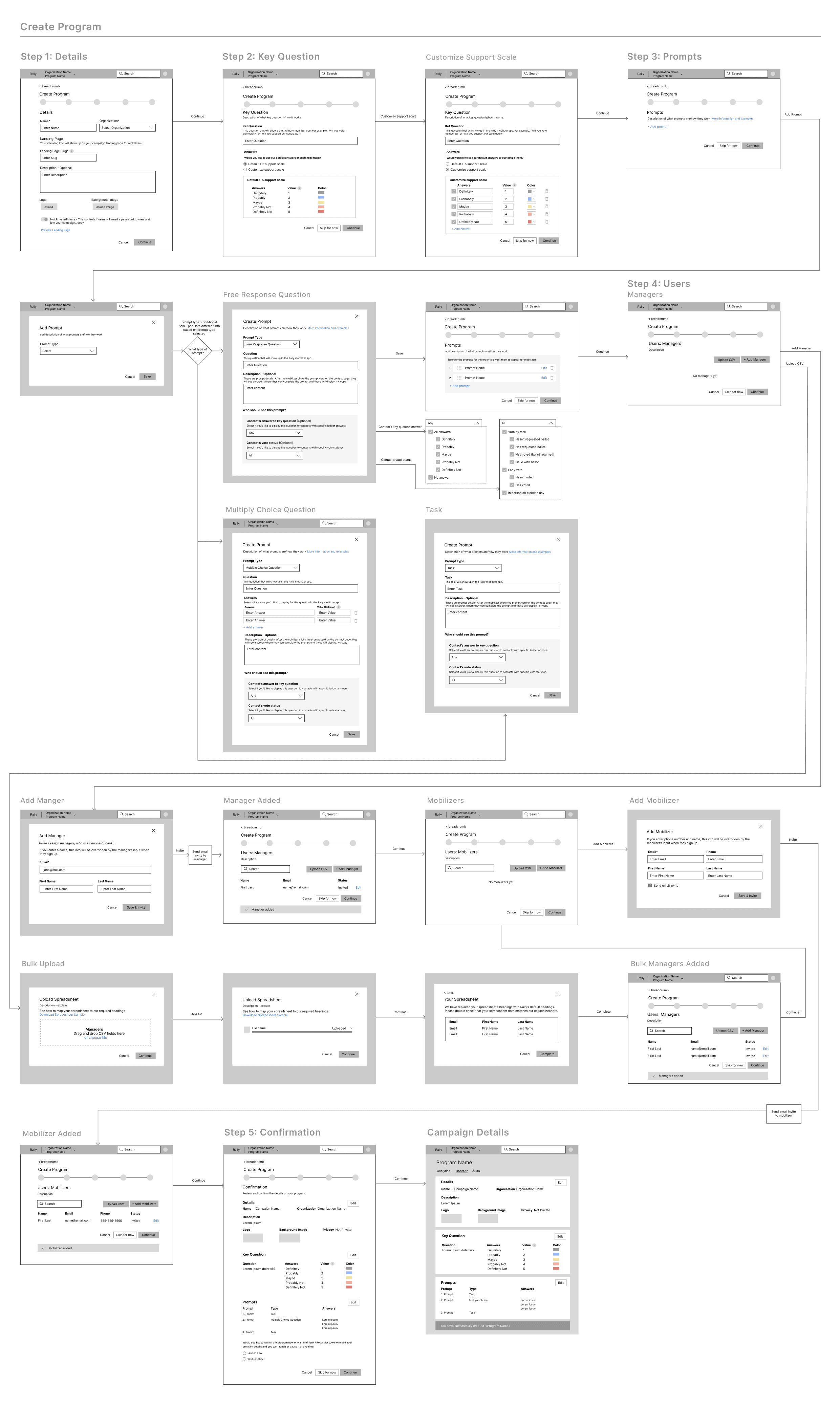
Step 1: Details
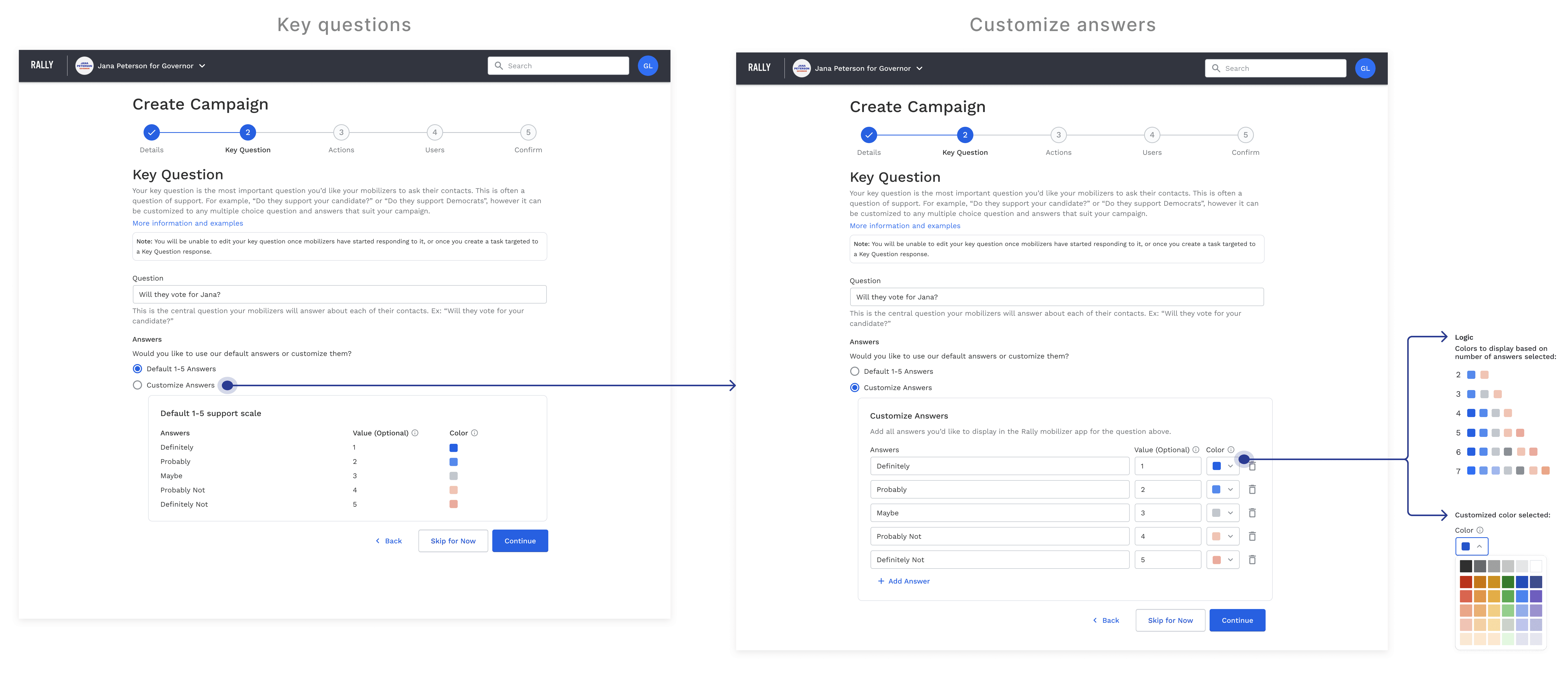
Step 2: Key Question
Step 3: Custom Actions
Step 4: Users
Step 5: Confirmation
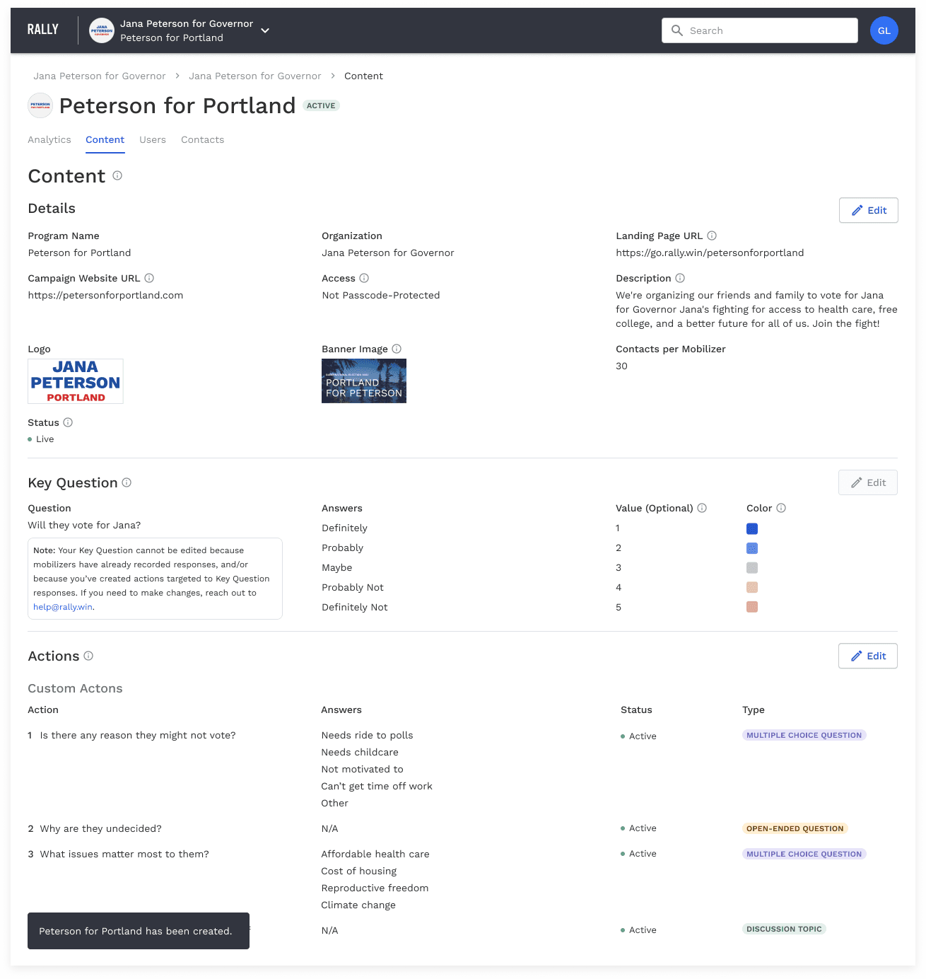
Content
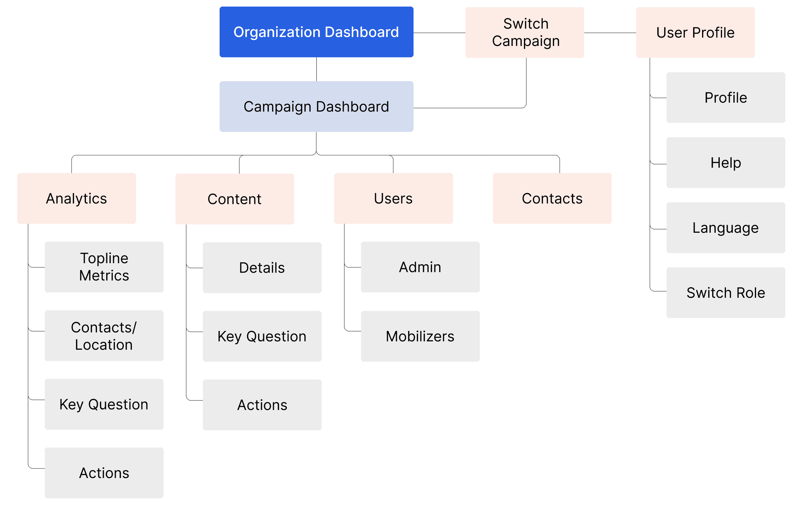
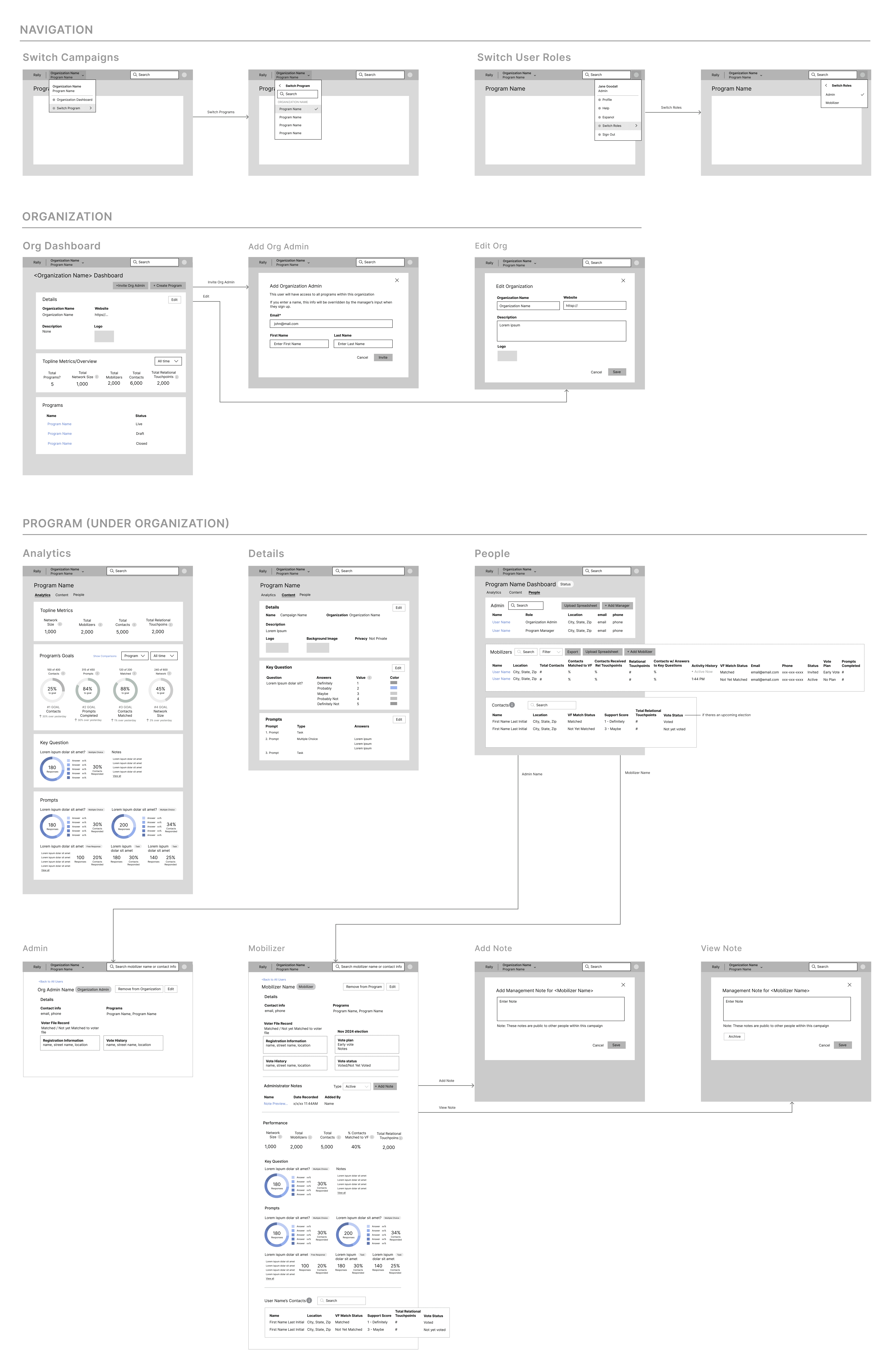
Once the campaign is created, users land on the campaign dashboard under the Content tab. This page includes all of the campaign’s content including general details, the key question, and actions.
Analytics
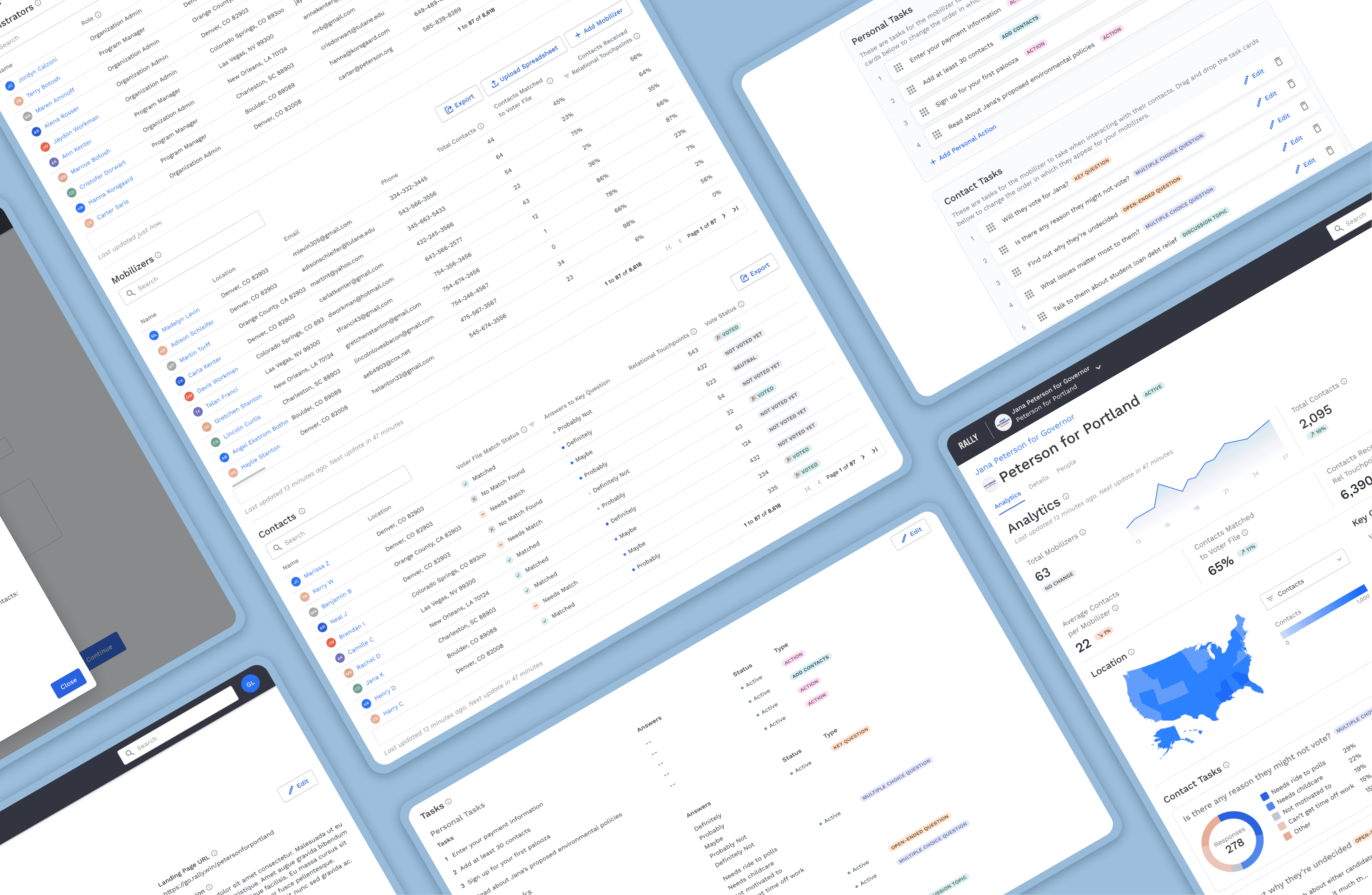
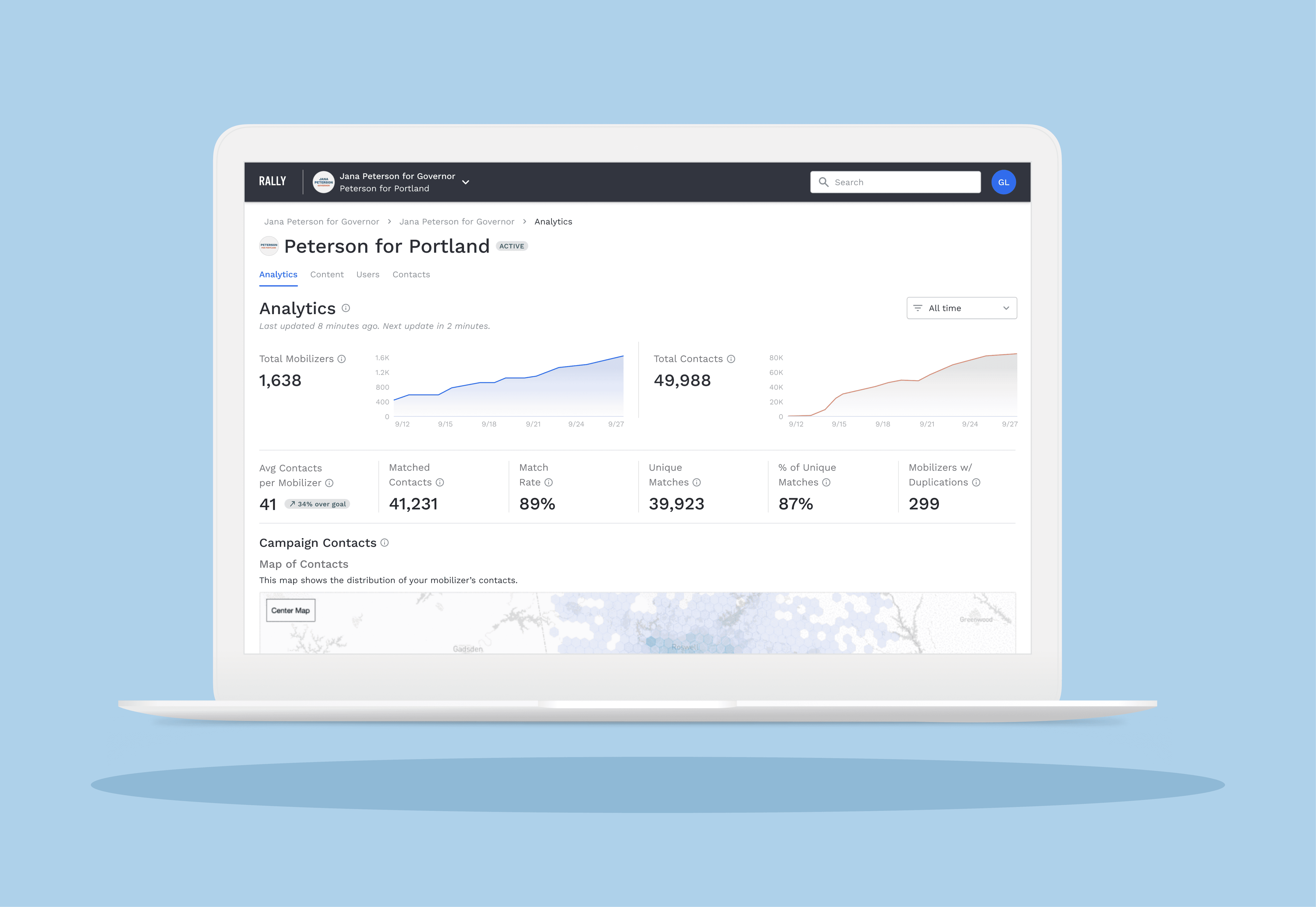
Analytics is the home page tab for the campaign dashboard. This page includes top line metrics, a heat map of contacts, and response data for the key questions and actions.
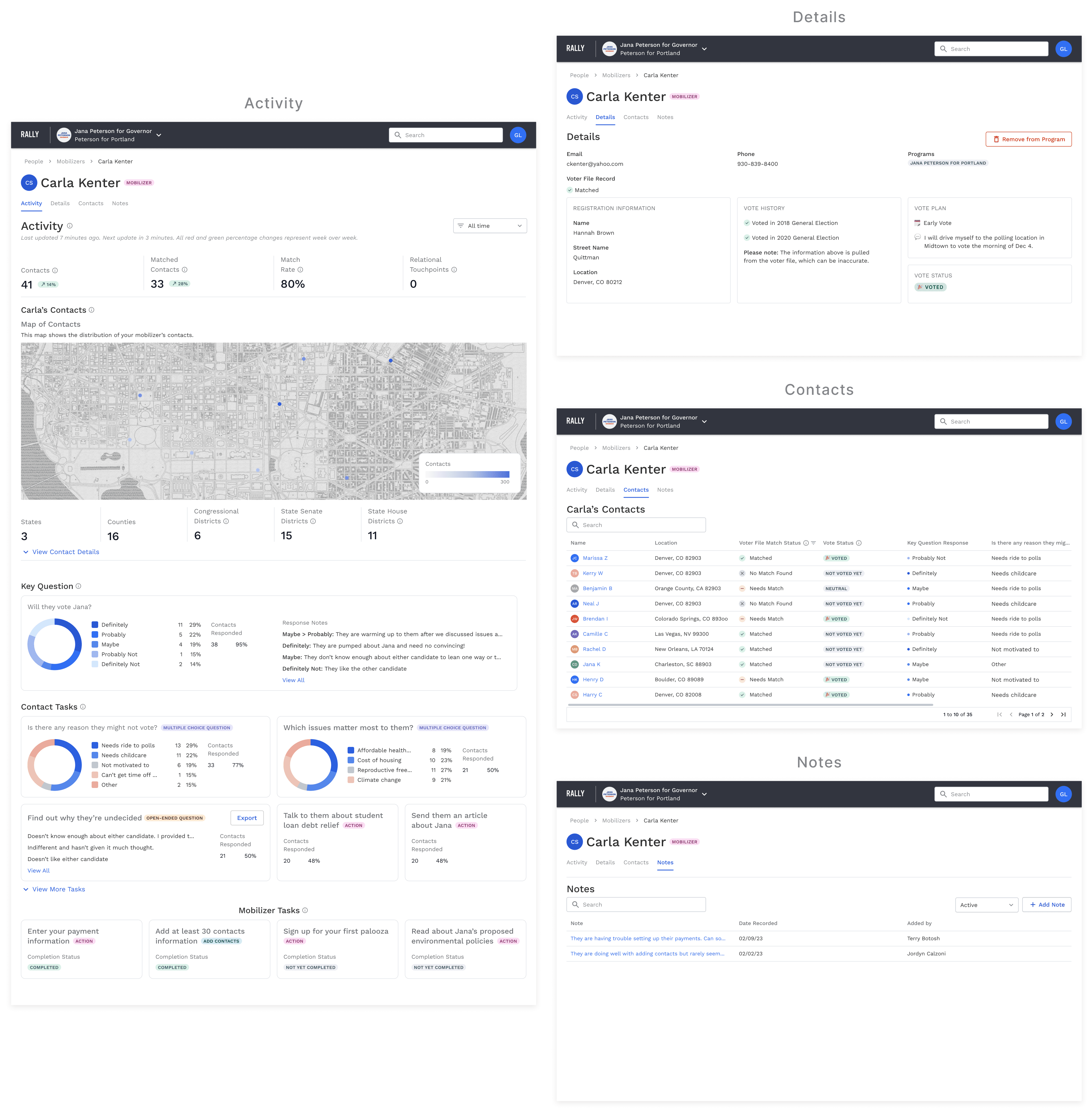
Based on user feedback, we worked to make this page clearer and more actionable than previous the version. I used visual hierarchy and colors to prioritize the most important metrics. We eliminated data visualizations that displayed less useful or rarely used data, in favor of the more useful insights.
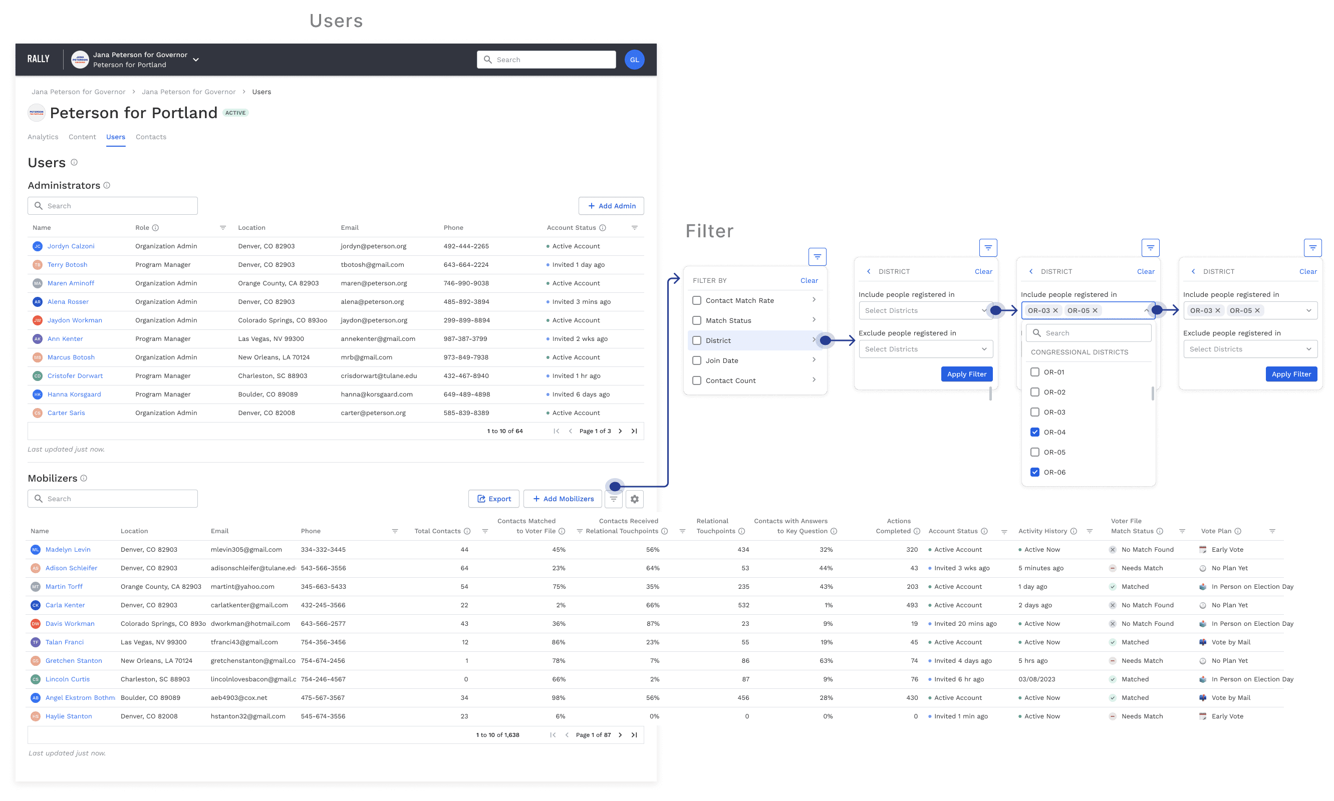
Users
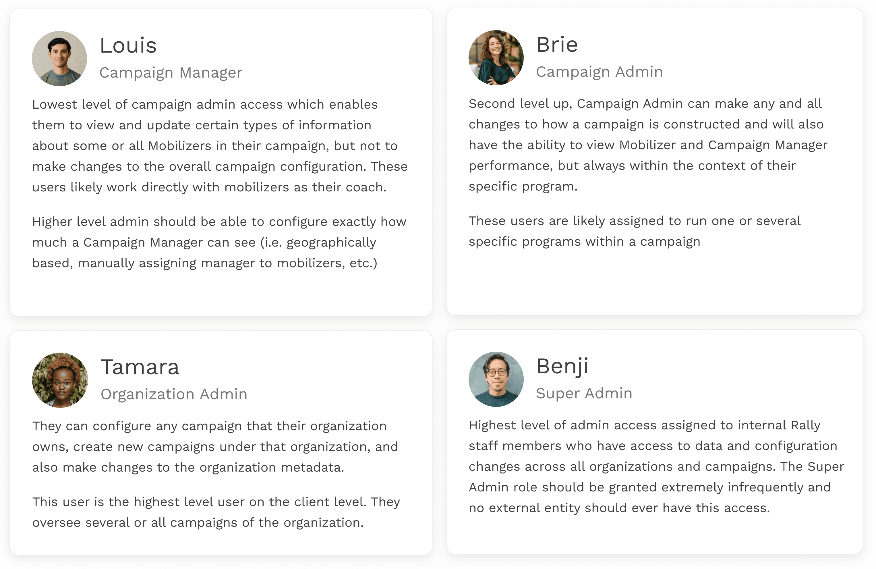
The Users tab shows all admins and mobilizers within the campaign. Permissions and invitations for new users can be initiated here. Each table includes contact information and actionable metrics about these individuals.
The mobilizers table can be filtered or sorted by data in order to do strategic outreach to mobilizers, shape conversations with them, and understand their performance.
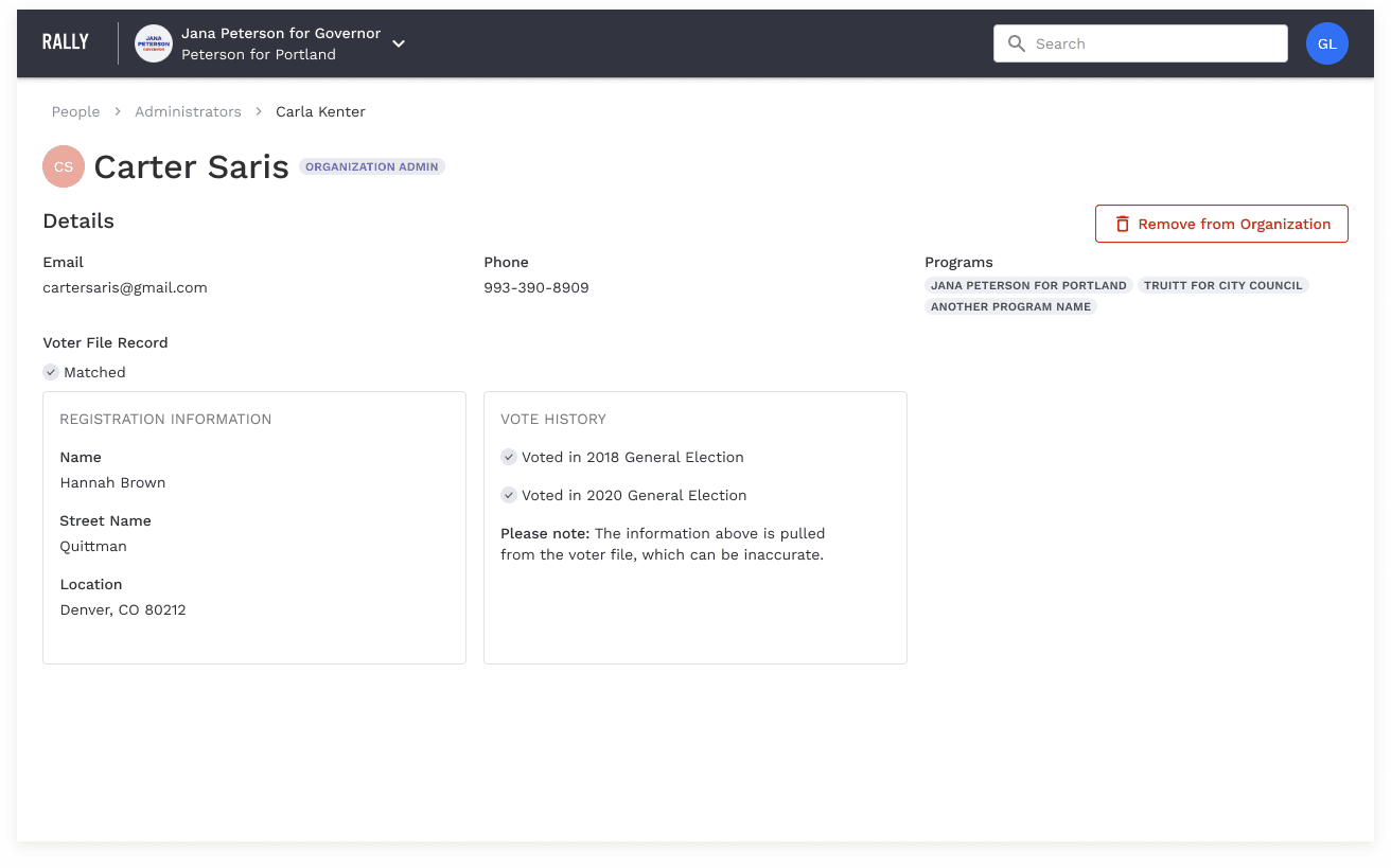
Admin Profile
When an admin is selected within the table, the user is taken to the admin's profile page which includes their general information and voter file record.
Mobilizer Profile
When a mobilizer is selected in the table, users are taken to the mobilizer's profile which includes their activity and performance, contact information, voter file records, a table of the mobilizer's contacts, and notes about them added by admin.
We designed these page largely around the use cases of coaches needing to prepare for their one-on-one meetings with mobilizers on their team. They were designed to help inform those discussion. Here you can find a deeper dive into the individual mobilizer's performance— where they are doing well and perhaps struggling. Admin users can sort the contact table by match status, key question answers, or vote status to determine which of the mobilizer's contacts are most valuable and worth following up with.
Contacts
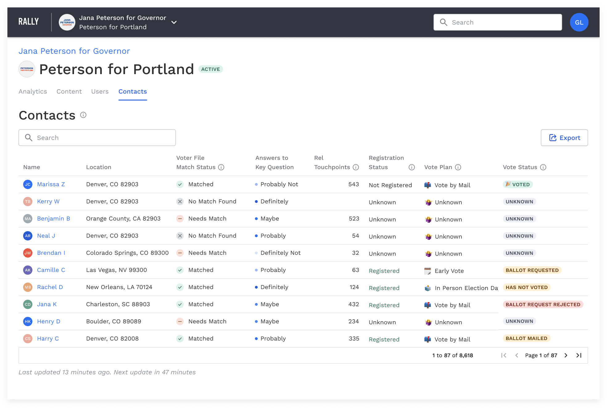
The final campaign dashboard tab is Contacts, which holds a table of all contacts added by mobilizer in the campaign.
Contact Profile
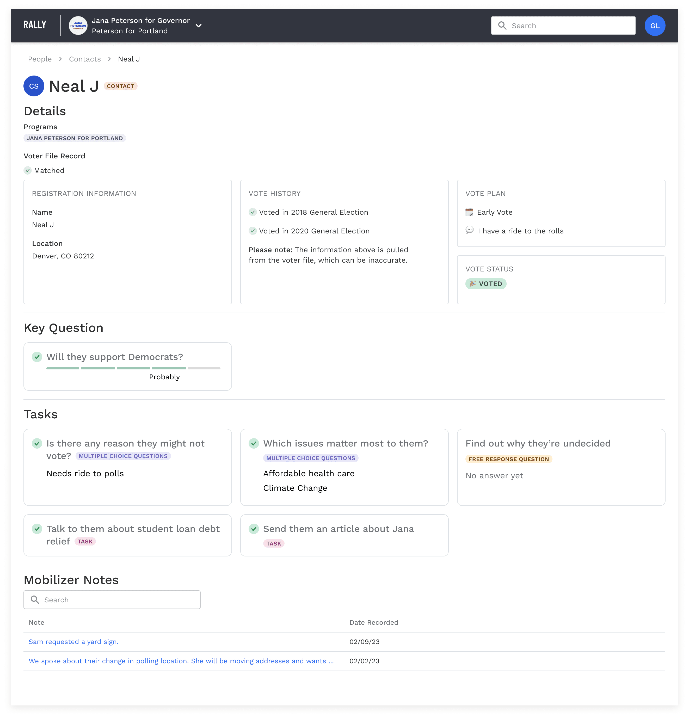
When a contact is selected from that table, users are taken to that contact's profile with their details, voter file information, answers to key questions and actions, and any notes left by the mobilizer.
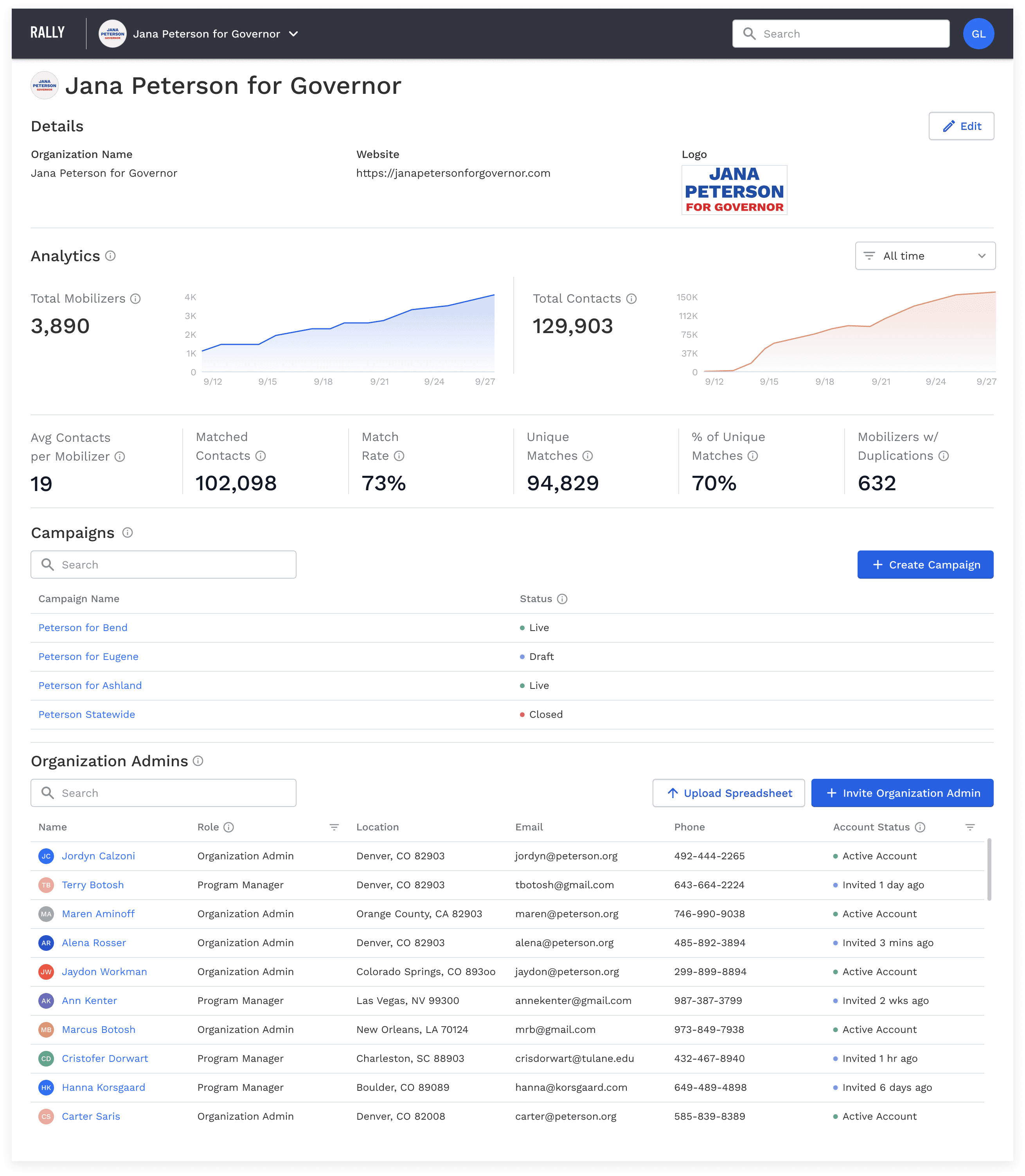
Zooming out, if users have multiple organization and campaigns they belong to, they can switch between them in the upper navigation via a dropdown menu.
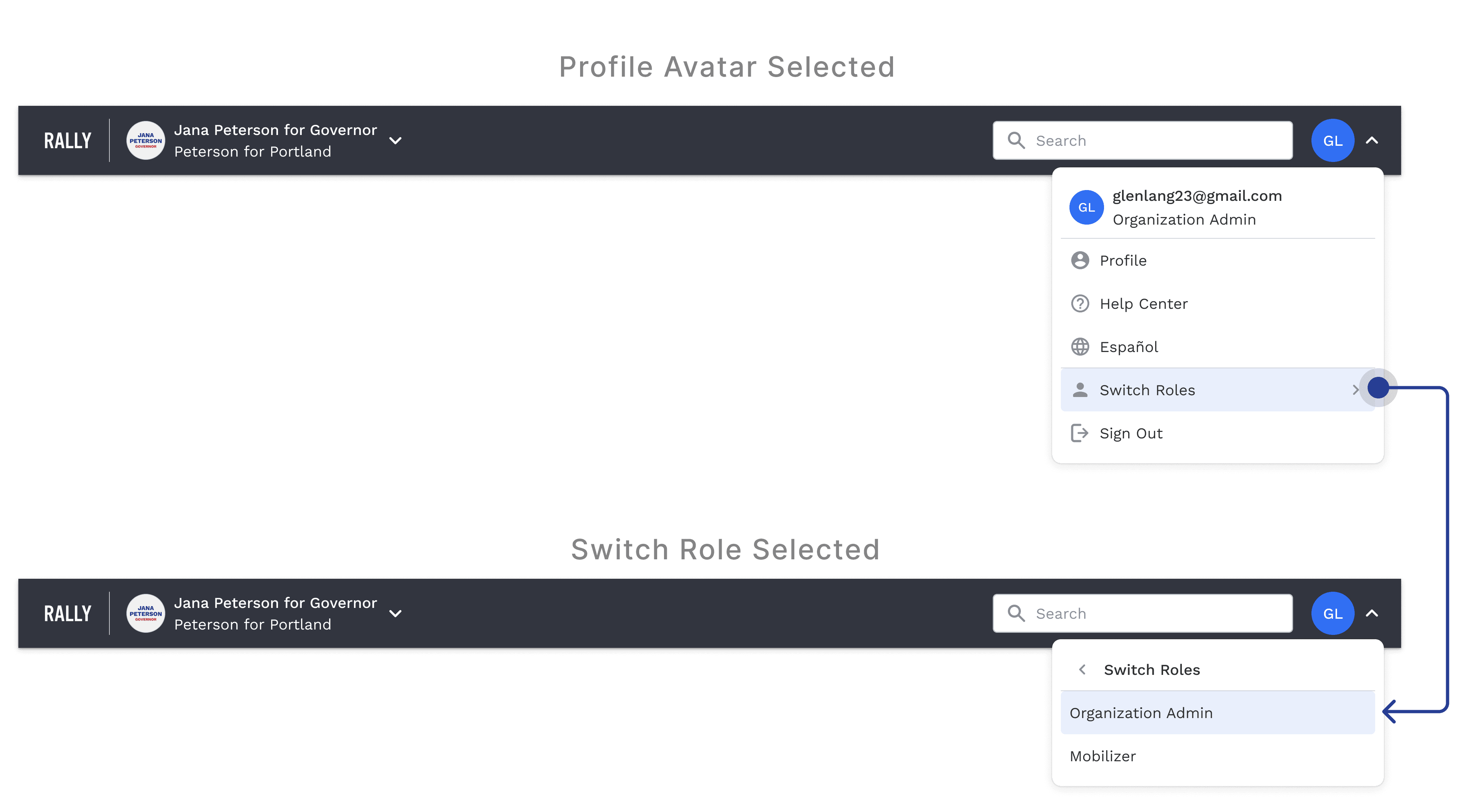
Under the profile avatar in the upper navigation, users can switch between their roles as an admin and a mobilizer.
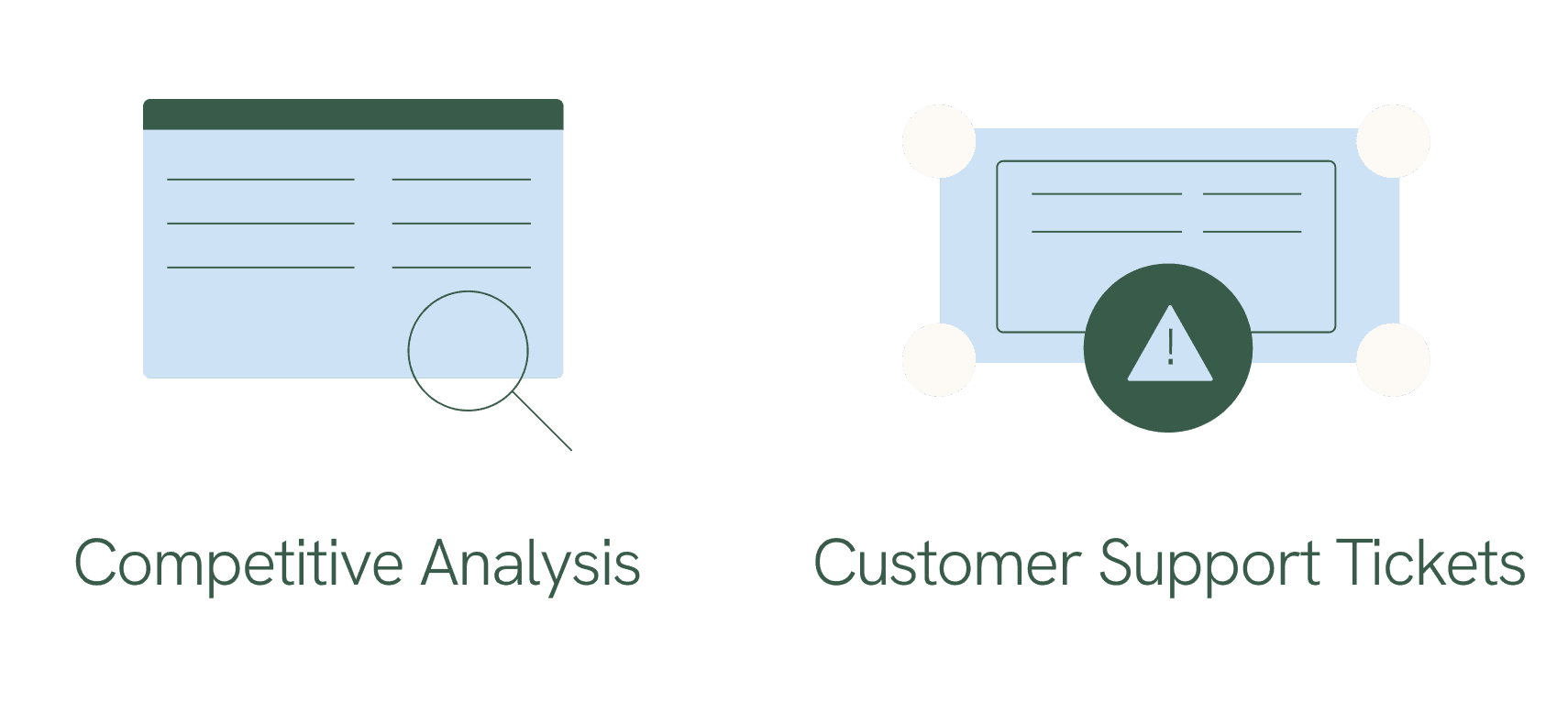
I was unable to get much longterm data about the performance of this project, however we received tons of positive client feedback, increased engagement with analytics, and far fewer support tickets about confusion and issues.


