Rally's Marketing Site
Rally's Marketing Site
Rally's Marketing Site
ux/ui design
branding
visual design
illustration
Marketing website design for political, relational organizing tools
Marketing website design for political, relational organizing tools

About
About
About
Rally is a relational organizing tool for progressive political campaigns. Relational Organizing is a more authentic way to do voter outreach, which involves people mobilizing their personal contacts within their network. This is typically done through calls, text, or in person conversations.
Rally is a relational organizing tool for progressive political campaigns. Relational Organizing is a more authentic way to do voter outreach, which involves people mobilizing their personal contacts within their network. This is typically done through calls, text, or in person conversations.


Overview
Overview
Overview
This project included the branding and design of Rally's marketing website. Rally needed a marketing site to explain their product offerings suited for two user types. First, campaign staff who would be coming to Rally because they are interested in running relational organizing programs. Second, people performing the relational organizing outreach on behalf of the campaigns. These are typically paid mobilizers or volunteers. The site would simultaneously speak to and serve both user types.
This project included the branding and design of Rally's marketing website. Rally needed a marketing site to explain their product offerings suited for two user types. First, campaign staff who would be coming to Rally because they are interested in running relational organizing programs. Second, people performing the relational organizing outreach on behalf of the campaigns. These are typically paid mobilizers or volunteers. The site would simultaneously speak to and serve both user types.
Team
Team
Team
I worked with a product manger, developer, and four internal stakeholders. I was the sole designer on this project.
Nora Grossman (Product Manager), Nick DiRienzo (Head of Engineering), Maureen Z. (Senior Software Engineer), Davis Leonard (CEO), Zoe Stein (Chief Program Officer), Greta Carnes (Chief Strategy Officer), Fiona Ramsey (PR & Communications Strategist)
Branding & UI Guidelines
Branding & UI Guidelines
Branding & UI Guidelines
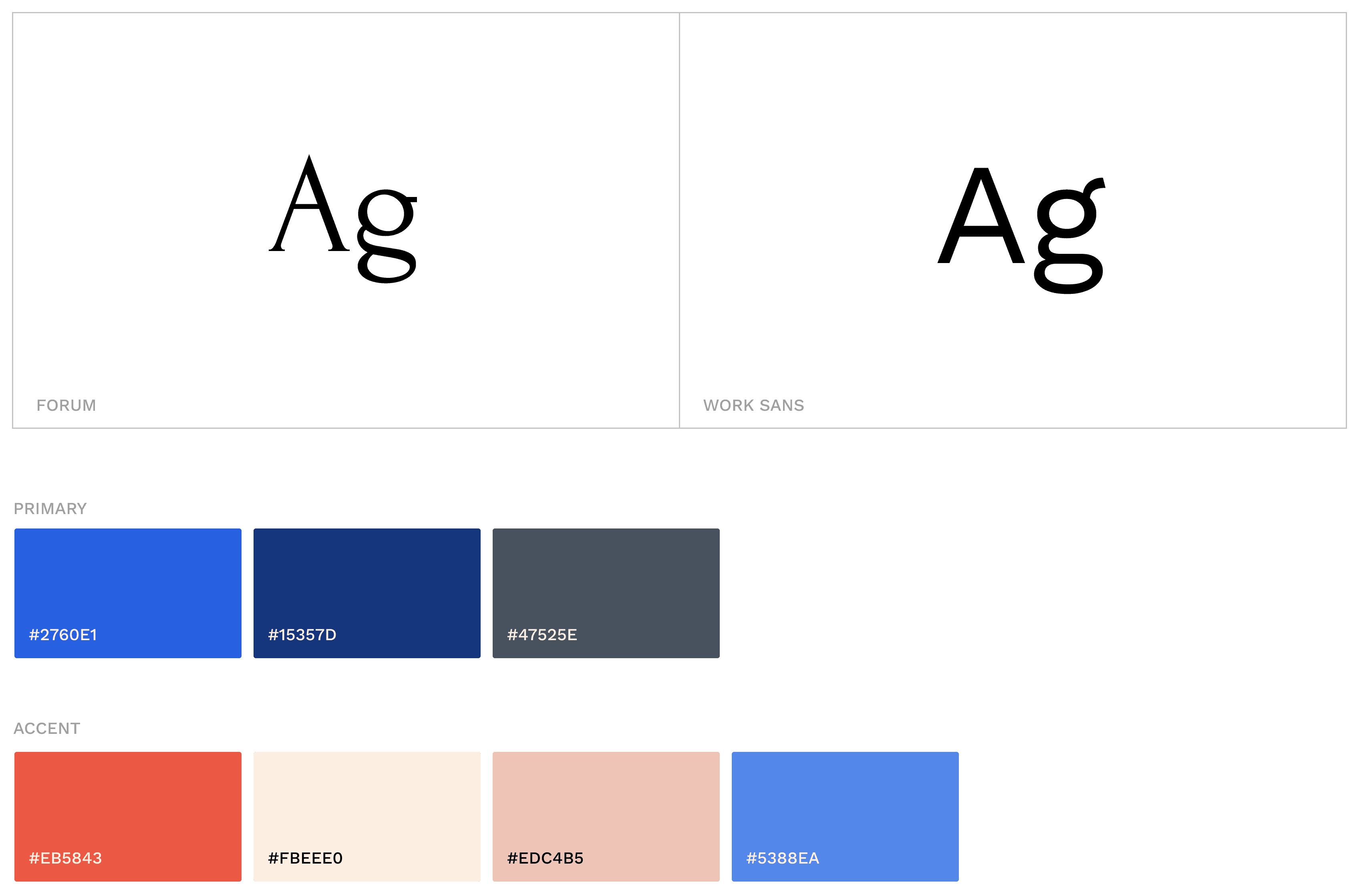
The team wanted to create a warm, friendly, approachable look & feel, as well as highlight its woman run team. The typography choices of Forum and Work Sans paired nicely and communicated a modern, feminine personality.
The brand colors were inspired by political colors with a modern, feminine touch.


Illustrations
Illustrations
Illustrations
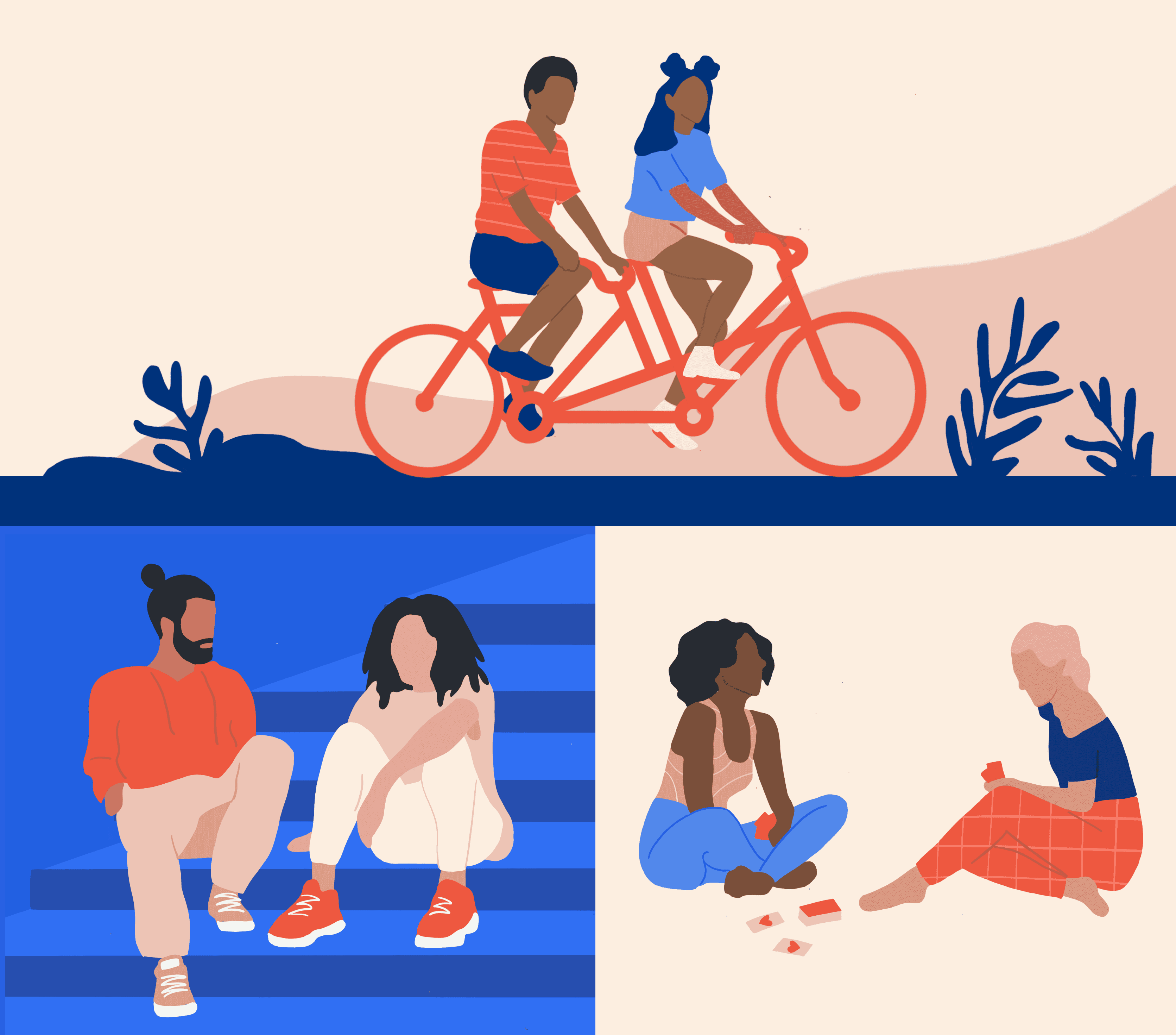
The team wanted to communicate diversity through illustrations. We landed on the theme of the illustrations to be displaying relationships and people connecting. I chose to depict friends spending time together with simple silhouettes, shapes, and splashes of pattern.
The team wanted to communicate diversity through illustrations. We landed on the theme of the illustrations to be displaying relationships and people connecting. I chose to depict friends spending time together with simple silhouettes, shapes, and splashes of pattern.


Design
Design
Design
Homepage
Homepage
Homepage
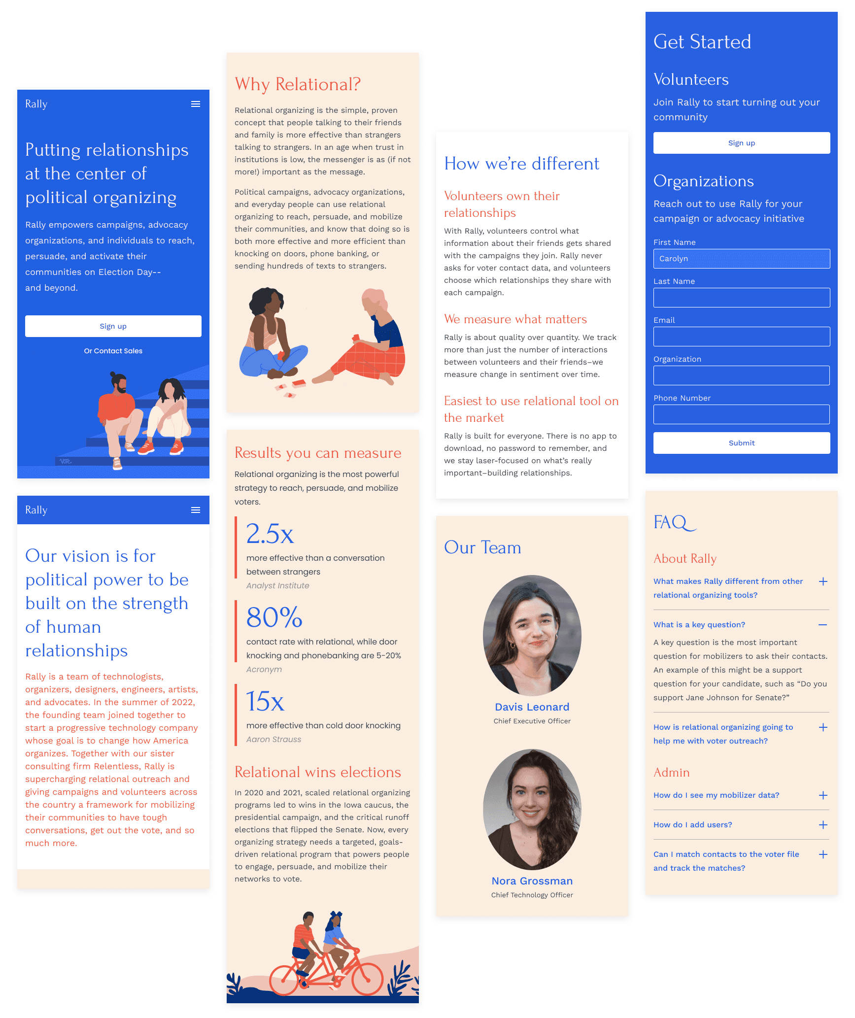
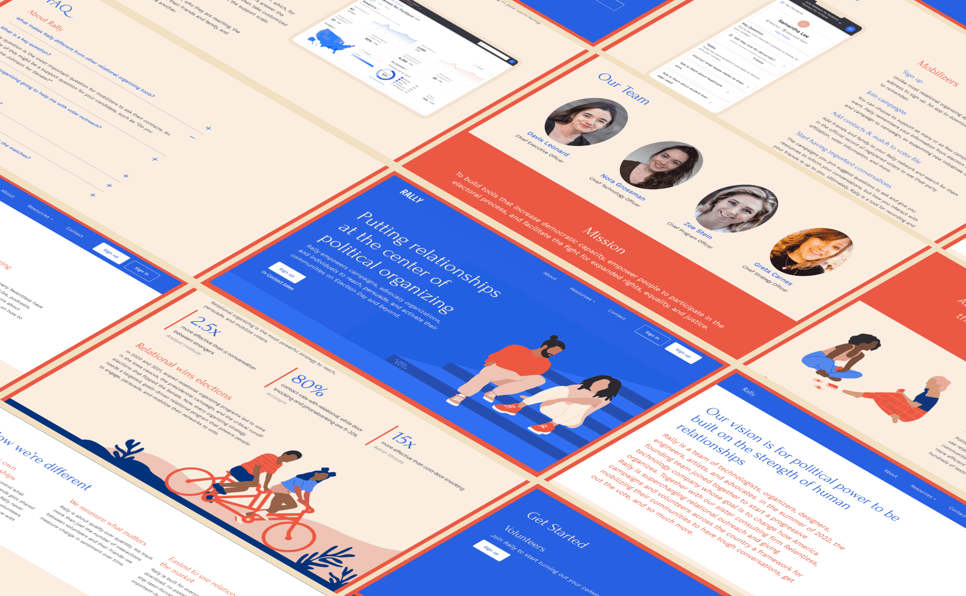
On the homepage, we presented the concept and power of relational organizing. We displayed statistics to drive home the effective nature of relational organizing compared to other campaign outreach methods. Since there are several other relational tools in the space, we highlighted our key differences.
For the user type doing the political outreach, we focused on the simplicity of using the tool, explained how the app works, and talked about a key differentiator of the user owning their data instead of Rally. For campaign staff and organizers, we touched on key features of the performance dashboard and ease of campaign management.


About
About
About
On the About page, we conveyed Rally's mission and vision, and presented the leadership team.
On the About page, we conveyed Rally's mission and vision, and presented the leadership team.


Resources
Resources
Resources
Resources was an area for customer support, resources, and FAQs.
Resources was an area for customer support, resources, and FAQs.


Contact
Contact
Contact
On the Contact page, people could join Rally as a volunteer or reach out to join as a campaign running relational organizing programs.
On the Contact page, people could join Rally as a volunteer or reach out to join as a campaign running relational organizing programs.


Responsive
Responsive
Responsive
The site was designed to be responsive across breakpoints.
The site was designed to be responsive across breakpoints.
